Page 3
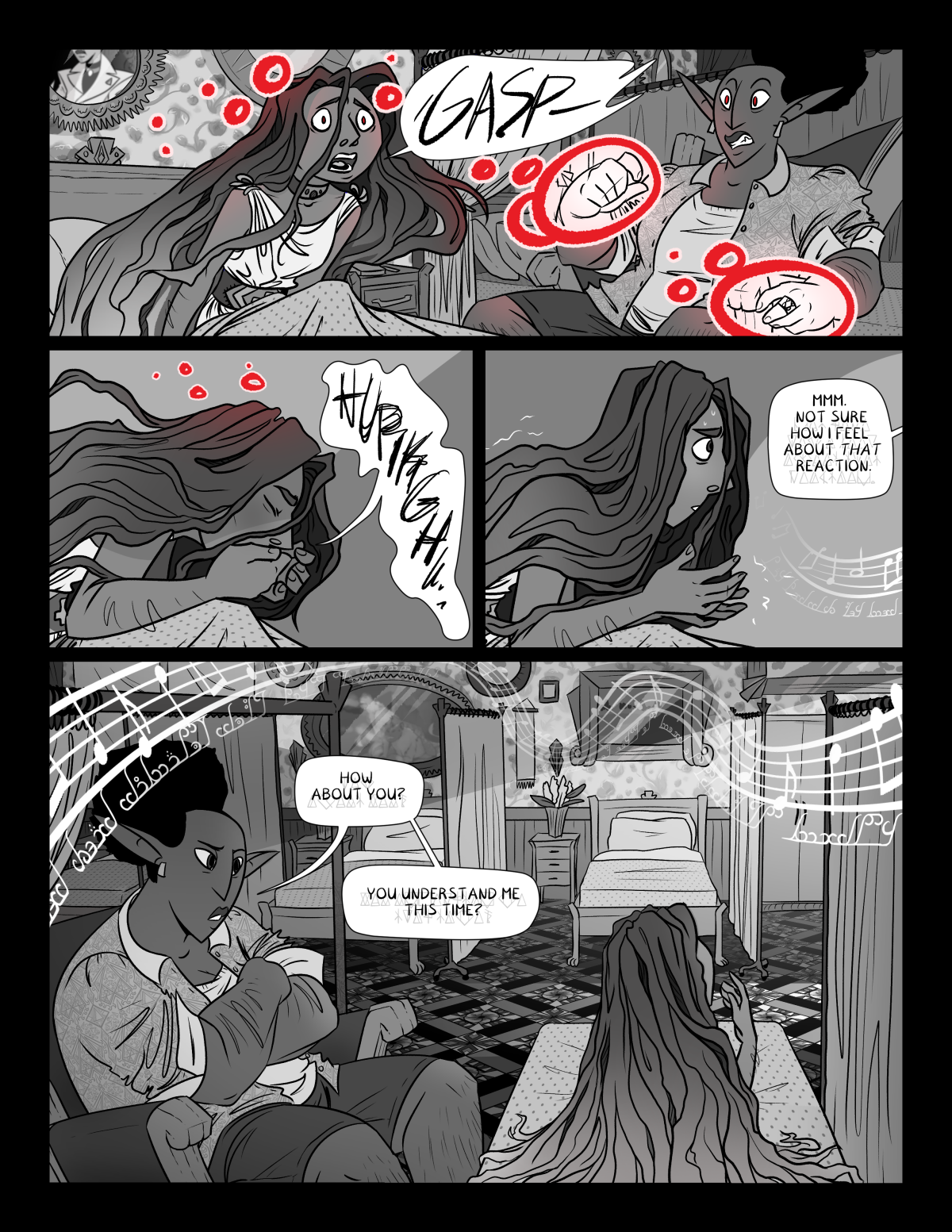
Ah, there’s the greyscale. Sort of.
In related news MAN i really thought it was hard to learn to use color for Hush — greyscale is twice as bad because you have so few options for differentiating stuff uuuuguggghhh. This was my first attempt at a background in greyscale Ever, you will see as these pages progress that I try a few different approaches as I try to decide what looks better.


Discussion ¬